Juror Keiko Tanabe
.
Juror Commendations
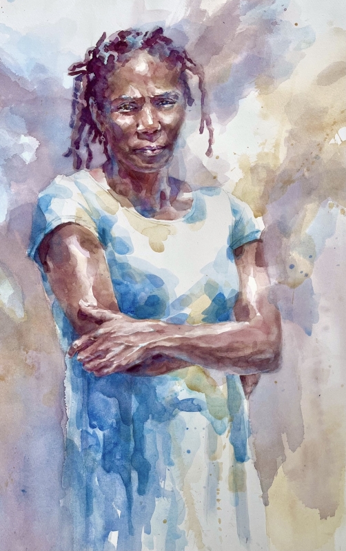
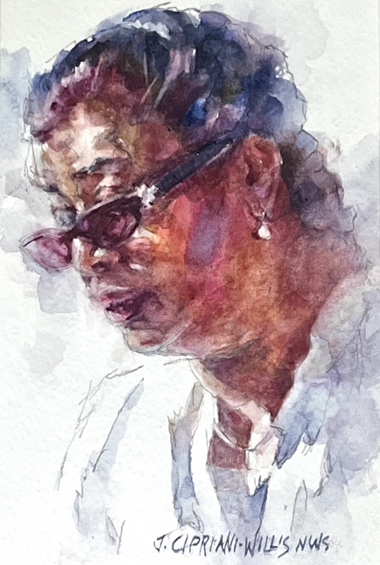
“Monica in Blue” by Janice Cipriani-Willis
This is one of the best paintings that shows where transparent pigment works so well. Look at the layering for the skin tones and in the creases of the clothes. The paint is so gently and softly placed, but it creates so much depth without making it look muddy. It shows the artist’s mastery of this medium. I like the color palette as well. It shows the personality of the person and also captures the light perfectly.
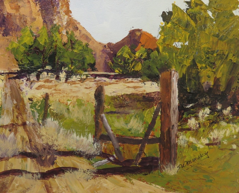
“Kodachrome Basin” by Susan Wormsley
I like the composition, with a high horizon. It’s mostly about the foreground. The artist got the light, and then because of that, the gate, the trees, the shadows of the trees, the contrast they all make is straight, and so striking. But also, my eye goes to the back, where the fence is, where the mountains meet the field. That strong contrast is really what makes this painting very, very strong. And it’s inviting as well.
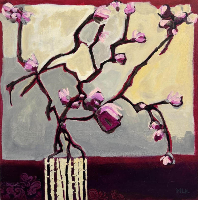
“Pretty in Pink” by Maureen Kerr
This painting is very bold, and also very delicate, in part because of the subject matter. But I think what I like most about it is the composition and the lines. The branches create a wonderful design. Although it’s a simple subject matter, it tells us that the beauty is everywhere, all around us, but really what’s important is the way we see the world. This painting is a wonderful example of that.
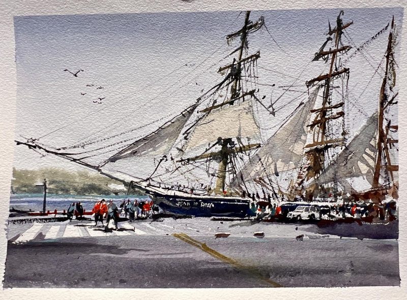
“Star in San Diego” by Kyron Brimmer
This is one of the most iconic views of San Diego, especially around San Diego Bay, and it’s very well captured, and it communicates about our city. I think we can all appreciate from this painting the color of light, and then also the ambience of the place. I think this is the kind of painting that we can participate in, and it’s very enjoyable.
Honorable Mentions
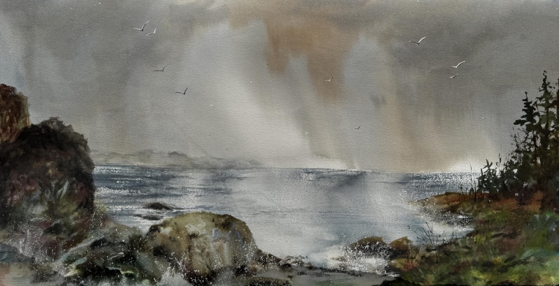
“Whispers From Above” by Lorri Lynch
I really like the size and the format. I like the energy of nature that the artist captures; we can all feel it. And also the bold use of light right in the middle. It takes a lot of courage to do that kind of thing. The image is very well balanced, with the contrast of the very soft light, and then the strong brush strokes in the rocks and trees. I like the balance and harmony that creates.
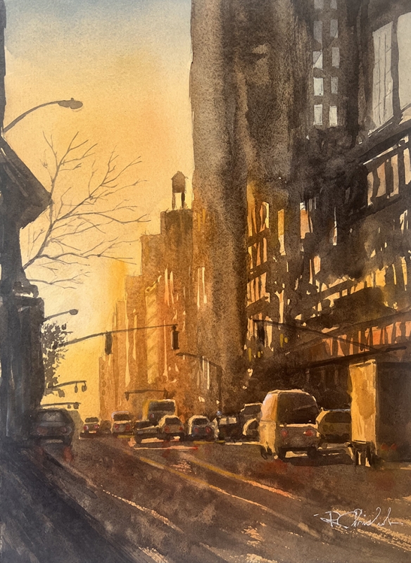
“Urban Sunset” by Robert Chisholm
The artist captured that time of the day, that feeling. It works because of the light, because of the color, and because of the atmosphere. I think in this type of painting, because of the street scene, there’s a nice perspective that draws us in. That’s a big plus. But what I like most about this painting is the way the artist captures the light and atmosphere.
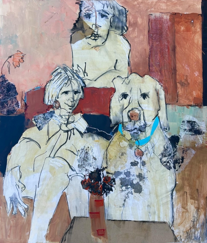
“The Family Room” by Roberta Dyer
I am so impressed with pretty much everything, composition, and also the brush marks and the texture making. What is most notable, though, is the lines. The line-work this artist is showing in this piece is quite impressive. That’s artwork in itself.
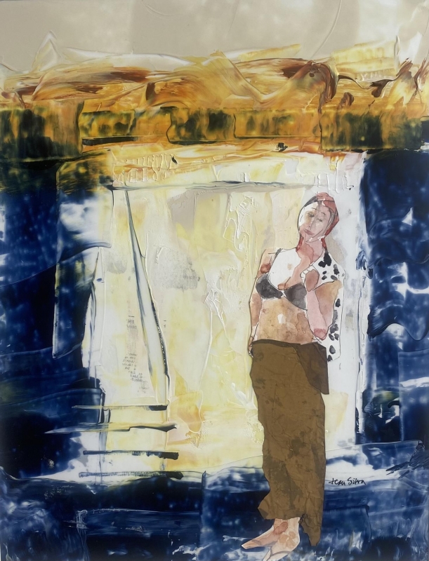
“No Regrets” by Jean Silva
This painting has a very remarkable competition. I also appreciate the color contrasts. By putting the figure in the middle of the empty space really makes it stand out. And yet, everything else is abstract. So, there are two different styles, and two different spaces. They are beautifully merged into one. I really like the tension between the two. It’s great.
Honorable Mention, Miniatures
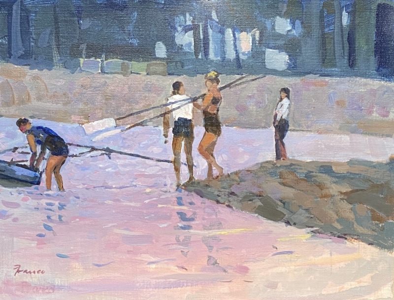
“Early Bloomers, 2” by Thomas Franco
This one has a story, and I really enjoyed being there in the scene. Technically, I was very impressed with the composition. There’s a nice flow from foreground to middle ground to background. The way the artist created the contrast between elements is fantastic. The color palette shows the time of the day, and the type of place, and it says so much about the atmosphere.
Best of Theme
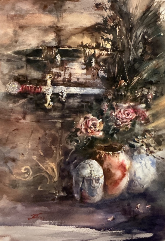
“Armor and Floral” by Fan Li
This is a strong painting, because of color, tonal contrast, and the treatment of the edges. I think what most impressed me about this painting is the manipulation of different edges. The artist did such a fine job of creating a very evocative image by balancing hard and soft edges. The artist creates a very special atmosphere, an almost dream-like quality in this painting. It’s quite wonderful.
Best Miniature
“Saraya” by Janice Cipriani-Willis
It’s a very compelling image. The first impression I had was very powerful, especially because of the rich layering of skin tones, and the stark contrast between the darks and lights. The facial expression that the artist captures is powerful, and it caught my attention immediately. The rich layering is just drawn on the face, but the rest is almost not painted. I like that kind of painting, because it’s very inviting, I see so much in the empty spaces But they’re not totally empty: there’s a gesture, calligraphic lines, and also a thin layer of wash, and that stirs my imagination. It is a very engaging painting.
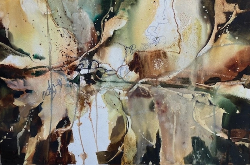
Third Place
“Midnight Magic” by Kathleen Scoggin
When I first looked at this, I thought it was an abstract painting, but I came back for a second and third look, it became more of a representational painting. I think it’s the way artists see the world, and that all the representational elements are just expressed in an abstract form. And I think artists should look at things or life this way. The artist was just honest and showing the subject the way it is. So that impressed me most, it being a very honest painting.
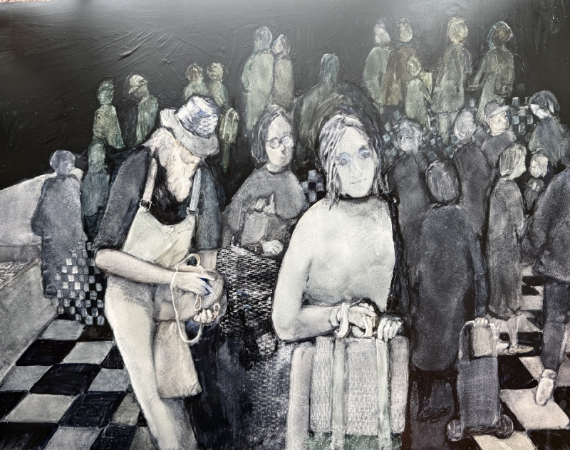
Second Place
“Market Place” by Helen Hayes
Marketplaces are one of my favorite subject matters. And usually, they are among my most colorful paintings. Yet, this artist uses just black and white, and that’s very interesting. Because of that, you can really appreciate the tone and contrast happening here. And then also, there is the story of what’s happening, and since there are not many colors, we are invited to kind of fill in the gaps. We can see so many different colors. This is really a great trick. This painting plays on us, and I really enjoy that aspect of it.
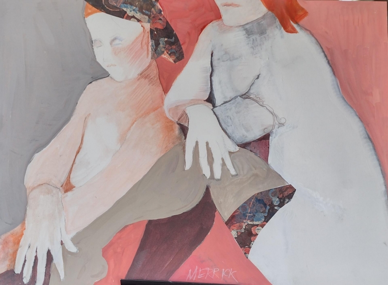
First Place
“Women” by Joan Merrick”
This piece is a fine example of “less is more”; it’s so minimalistic, but it says so much. And it spoke to the most, and it deserved the best in show. The design, especially the composition, is excellent. There’s a focal point. There’s perspective. It has a power to invite the viewer in, and that’s an important quality for me. The way the figures are depicted, with one person’s face cut off, makes the figure into just a shape. It’s almost an abstract painting. All the pieces are juxtaposed with the lines, and the colors, with everything working together. Everything comes together beautifully.