Juror Stan Goudy
.
Juror general comments
I want to make a general comment about entering shows. If an artist gets rejected it doesn’t really mean anything. It can mean something, though, if an artist takes it to heart and says “well, maybe I could have done this or that”, but this is so subjective. I have had the experience in my career of putting my painting in and having it get rejected. Of course, I think the judge is a lunatic. Is he/she blind? So being rejected only should motivate you to paint another painting and submit it again and then paint another painting.
If I paint 100 paintings, I am probably going to get 10 that I really like. If I paint 10 paintings, I might get 1 painting that I like. If I paint only 1 or 2, I am not going to get anything I like. The secret is to paint a lot and grow rhinoceros skin, as you must have tough skin, and just paint a lot.
Even after being accepted in the show, we must move on from that too, and keep doing what we do. Each one of these paintings here, for example an honorable mention or juror commendation, could have been second, first, or third place. They’re all so good.
As I have gotten older, I have gotten more appreciation for abstract painting and so I have included some abstract pieces to honor those artists that prefer working that way. I think that the paintings I have selected here each has an abstract element to it that I like. They are all so well done.
Final note remember that there are 5 principles of painting: drawing, value, composition, color and technique.
Juror Commendations
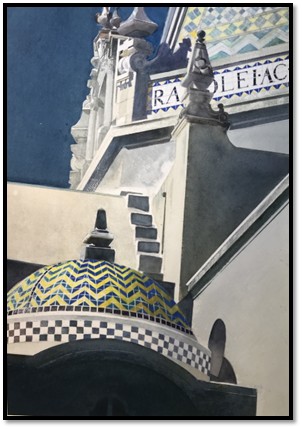
“The Tiled Dome” by Edward Abrams
I am familiar with his work, and I love his work. My wife has a piece of his. He is a master at drawing lines and value control. So those two things are working 100%. The composition is excellent. I have been down to these places and made drawings, and he has come up with an interesting perspective that is just fabulous. Of course, his technique is flawless.
The reason value is number two is that it is the glue that holds everything together and the way that he has arranged these dark shapes and the mid-values, and the lights are just stunning. Really beautiful. Look at the dome here. It starts off kind of light and then gets a little brighter and then subtly goes into the shade and then joins up with this shape. It is beautiful.
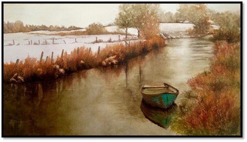
“First Snow” by Lynette Bredow
I think it is an absolutely beautiful painting. I love the serenity in it, the peace in it. I will speak for myself – in this world I live in, I need a lot of peace and need a lot of serenity, and she has really captured that here.
I am always a big fan of a tonal palette, tonal meaning relying more on values and color. These muted palettes are just beautiful by themselves. All the warm colors, burnt sienna maybe, burnt umber. The design is superior.
A lot of times when artists paint water it creates a hole, but not here as our eye goes back into the painting and moves you around. Certain elements in paintings are often not placed where they have the most impact and she has put the color of the boat in exactly the right place. I can’t see it being anywhere else. It is a great picture. The value control is excellent.
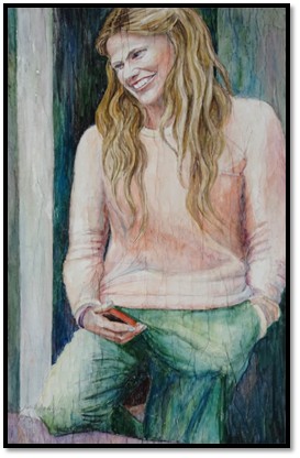
“Happiness Is…II” by Julie Anderson
Starting with the drawing, the drawing is great. What I do with these principles is I try to in my mind give them a score of 1-10 in drawing. In this case it is really good, a 9 or 10 for sure.
Values are great, composition is great. It is hard to compose a single figure, but I think she did a super job here.
I like the concept. I know a lot of these artists are really professional, but there are some things that happen in paintings that are so great that a professional artist just knows how to do. The only place in this painting where there is any red is right next to the green. I don’t think it happens by accident. It happens out of experience and lots and lots of painting.
I like the abstraction in the background. It is just simple shapes that set off the figure. I always think figure painting is so difficult to do well, and she really did it well. The features and everything are just where they should be, Hands are difficult, and these are just great.
Honorable Mentions
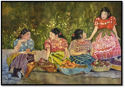
“After School Market by Catherine Alvarez Smith”
I really love this painting. I think all the figures are well drawn. The drawing is really good, and the values are good, the composition is good. It is a nice linear composition, but it is very intriguing. I like all the varied shapes. The color is excellent, and the technique is really good. I especially like the way she did the background showing us a whole lot of foliage, but in a very abstract way. I really appreciate that. The technique throughout is good. She obviously knows how to handle watercolor painting. There is a lot of careful painting in this one which I also appreciate. I don’t see anything I would do differently. She did a superior job with the figures and the fruit in the front. I love work like this where you have dark mid-tones with little pieces of white showing through. I don’t know if she lifted that out, but it looks like she did and then it’s repeated in other places. Excellent job.
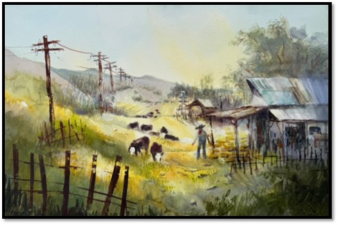
“Grazing the Pole Line” by Lorri Lynch
First, I love the title. I think it has a great sense of lightness. The light in this is just beautiful. In my own work I find green hard to handle but she has done a really good job with the greens. I like the fact that it gets blurred as you move into the distance. It has some nice darks upfront which pushes everything back. The drawing is good, the color is good, the values are good. Everything is working well together in this painting. I like the receding telephone poles as it takes our eye into the distance and then moves you around the painting. Really good job.
“Science Fiction” by Carol Mansfield
Obviously the drawing is well done, and the values are also very well done. There is a nice distribution of the darks, mid-tones and lights, and the composition is great. I didn’t know what the titles of these paintings were, but the title of this one certainly fits and shows there is a concept that she has something in mind here to tell us. The technique is superior, the biggest round shape has so much neat stuff that is going on in there. Everywhere you look there is something interesting happening. Beautiful composition and technique are working well.
Honorable Mention, Miniatures
“Aura of San Elijo Lagoon” by Mary O’Boyle
I like this one. I think it is a charming watercolor. It has nice lost and found edges, you know there are hard and soft edges, and the drawing is good. The calligraphy work is muted but there are visual surprises here as well, like this magenta color here. You would not normally see that in a landscape painting. That is very nice. It is very watercolor and spontaneous looking and very loosely done. This was not easy painting to do.
Best of Miniatures
“Remembering, Study” by Julie Anderson
There are 5 principles of painting, drawing, value, composition, color and technique. This painting shows a lot of bravery. Figures are the hardest and the drawing is good. The values are good, and I like the abstract box behind the ear, so we have realism and abstraction. The composition has got a nice weave in here to the face and the color is good as it is a muted palette which I like. I think this is kind of a visual surprise for me. The green against the pink is very nice as green and red are complements. It is a super job.
Best of Theme
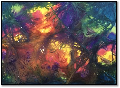
“Caught in the Web” by Astrid Edel Walter
The painting has a lot of energy, and I like the fact that it is not all clear. Some of the subject matter is kind of diffused and it is kind of melting into the background. I like the energy in this piece, not only the line work, but the color as well. To me it best represents the theme of motion as I see a lot of motion in the painting. I feel the motion, so that is a really good job as far as the theme goes. I think it is the best one.
Third Place
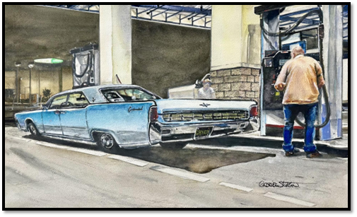
“Smiling at a Great Car” by Gabriel Stockton
Composition and design are everything and he has great composition, and it is very intriguing to look at all the shapes. The value control is really exceptional. I love what is going on in the background with the color in the front and the muted palette in the back and the values are working really well. The concept could be looking at a great car. Us old timers look at the old cars as we love the old cars. Nowadays you can’t tell one from the other. You used to be able to say it is a Ford or a Chevy, but you can’t do that anymore. They make one design and just pass it around. I like the fact that he distorted the perspective, and he took this great car and really exaggerated the perspective and he is pointing us back into this corner here and then moves us around the painting. It is really well done. I like this painting a lot. The color is great, kind of subdued, which I like. This background area could be a painting by itself. Excellent!
Second Place
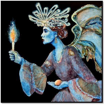
“Protecting the Future” by Wanda Honeycutt
The composition in the piece is striking. The shapes attract the attention right off the bat and the values are wonderful. As far as color is concerned, the light shapes play against the dark shapes. The black background is super and over on the right-hand side there is more black for balance. The drawing is wonderful. The color is great. Everything about this piece is superb. It could be a first-place painting also. It has a really lovely mood to it and a great concept. The egg in the hand and the candle makes it a beautiful concept. I like the blue in the face and the neck, and it is repeated throughout the painting. Drawing hands is not easy, and she did a great job with them. Everything is working with this painting.
First Place
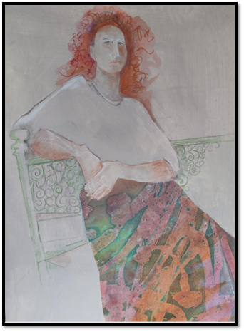
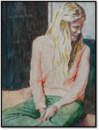
“He, She, They” by Joan Merrick
I mentioned earlier the 5 principles of painting; number 3 is composition. It also includes concept, so number 3 is the most important principles of composition/concept. This is a concept piece for sure and the composition is really great. The values are lovely, and the color is great. I like the muted palette. While this is colorful in the garment area it is overall muted, which I like. The drawing is really well done, and I think everything is working in the drawing and the values. The composition has a concept, the color is good, and the technique is really good. I like the gray background as it really sets off the red in the hair. I like that there are a lot of lost and found edges, like where the figure can leak out into the background, so it makes a really nice design. It has a lovely mood and I find it fascinating. It is very well done.