Juror: Geoff Allen
.
Juror Commendations
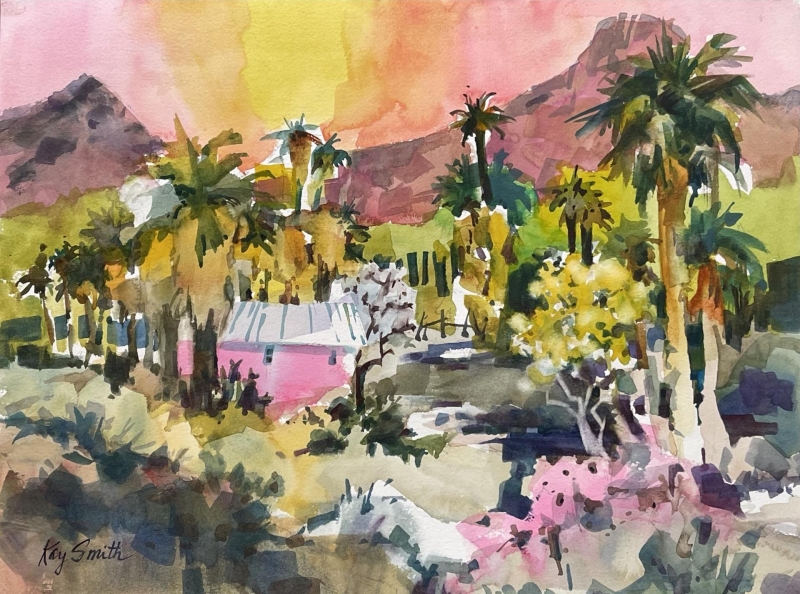
“Palm Desert Glow” by Kay Smith
I was really attracted to the color, to the freshness, to this building surrounded by vegetation, but yet being a part of it. It seems like there’s a lot of color, but it’s also a limited palette. I just love these areas, big, medium, and small of pink: big, big pink in the sky, big warmth, with less on the building, and then, in the foreground, in the vegetation, these three little areas. It is just so nice.
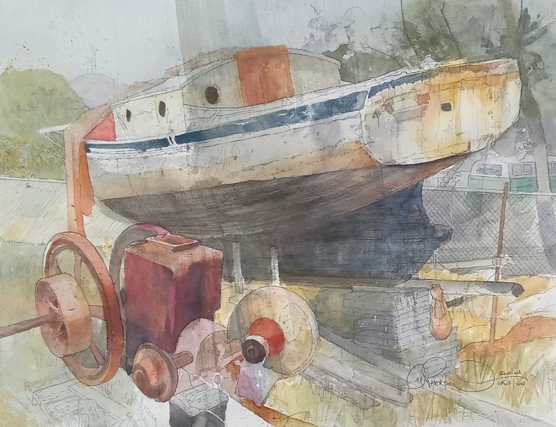
“Abandoned Dreams” by Chuck McPherson
This painting shows such a strong hand. I love all the lines that are left in, without filling them in, almost like the artist knew better and stopped to let the brush not touch down there. This gives it a graphic quality. The composition, with the strong diagonal, and those wheels, all those circles and ellipses take you around the corner. It’s a really complex arrangement, giving it a perspective that works with the lightness, making it feel far away. I feel like I’m looking through something to get to it. It is well thought out. I love the writing on the bottom, too, with the signature that just goes with the whole penmanship and the dexterity of the painting. It’s beautiful.
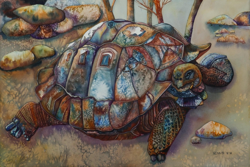
“Native to the Galapagos Island, Ecuador” by Irena Noreikaite Petraitiene
I noticed this powerful piece from across the room. I usually look for different compositional components like diagonals, but there was something sort of popping out of this image of this turtle in this environment, that it is a real part of. It’s an extremely textural piece. It almost looks like it’s fabric because of the shape being like a swatch, and coming together to make a greater thing, like a quilt. And that’s echoed of course by the shell of the turtle, but some of the other things in the painting seemed collaged as well. It is a watercolor, but here I am thinking about quilts, and I think when a painting can take you outside of what it is, that’s a really unique thing. It seems like it tells a story and I like that.
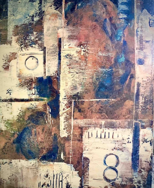
“Lucky Eight” by Keith Warrick
What I thought was so interesting about this is that it has a cubist feel to it. It uses limited color, so it’s all about fracturing space. It is both two- and three-dimensional. There are gradients of color, done in acrylic and using a dry brush. There are some other things that are almost graphic: the figure 8, a ticking, some lines, and then brush strokes that partially cover something that’s behind, so you’re looking through one thing to something else. It has a depth to it, but also a clear surface. It’s very convincing, because, to me, Cubism has sort of a classic look to it, and this painting hits that look.
Honorable Mentions
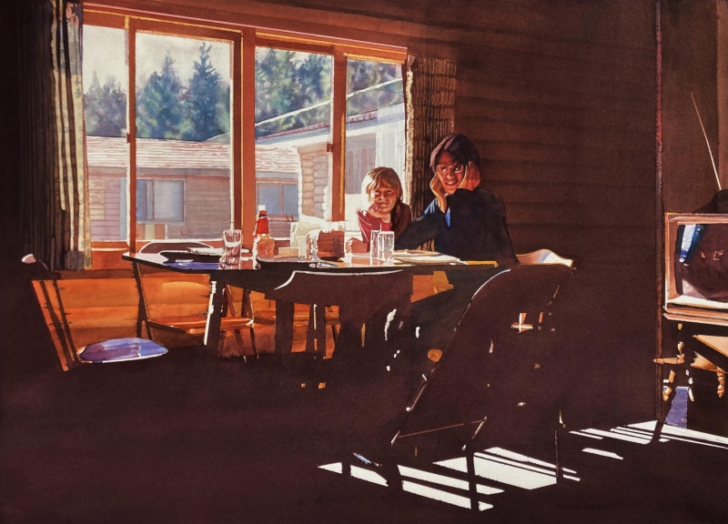
“Rainy Day at Breezy Point” by Michael Garberick
This painting you have to get close up to. There are several things I love about it, and one is getting rid of all that shadow detail. That is basically keying towards the light so that everything in light is really in, in that you can see it. It has a value to it. And the shadows are a nice, rich, brown, just so even. The TV with that little bit of blue adds to a great composition where that slice of TV window, compared to the size of the real window, has one bigger and one smaller. The diagonals help frame the people. It has a nice Fibonacci feeling that shows everything coming back to the people, but it’s very subtle, and it’s wonderful. The items on the table, the softness of the trees in the back, present another light versus dark contrast. The whole painting spans the graphic versus realism spectrum.
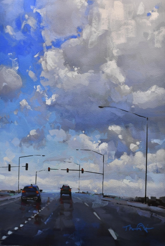
“Road Reflection II” by Thomas O’Brien
It can be so hard to get a plein air painting to look like a moment. In this painting, it’s about taking things away. Here is the road, and in terms of value it is taken away; whereas the sky is in full light and dark. And somehow this just feels like a moment that we’ve all shared, too, going down the freeway. The scale of the cars, and that swishy feeling, with the colors and the lights create so much feeling. I really wanted to select this for an award.
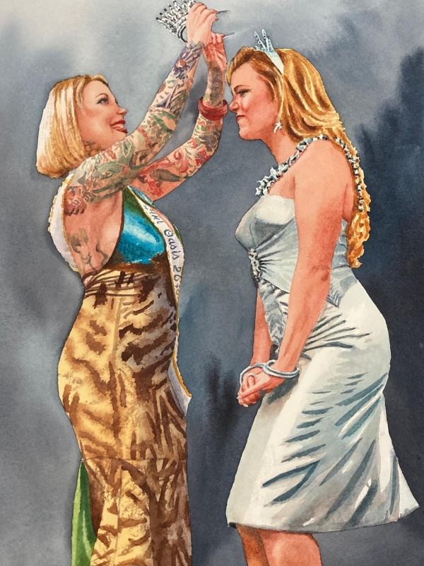
“The Crown” by Stephanie Van de Wetering
This painting is 100% pure: those figures, their skin, what they’re wearing. I look for that kind of purity in all the pieces that I selected. This artist has kind of narrowed down what we see. It has one voice and recognizes that art can be about what we leave out. The background is very soft and gray, and there’s this lusciousness of two women with a yin-yang sense of how they fit together, how their arms are. They are two separate pieces that fit together, although they are barely touching. The use of light is excellent on that dress. It is very convincing, and it really, really pops with intensity.
Honorable Mention, Miniatures
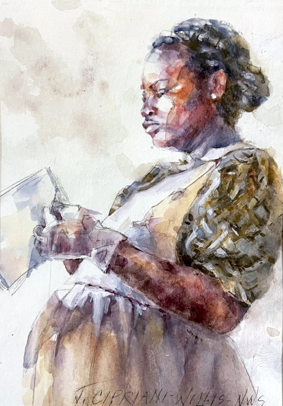
“Waiting” by Janice Cipriani-Willis
What I thought was significant about this piece, really, is just the sensitivity used in depicting this figure, and how the figure sits in the frame, the posture, leaning back. Then immediately I go into the surfaces, which are created using an application method that’s very intense because of how the pigment is put on and maybe lifted off. The painting really shows the humanity of this person in a moment of time.
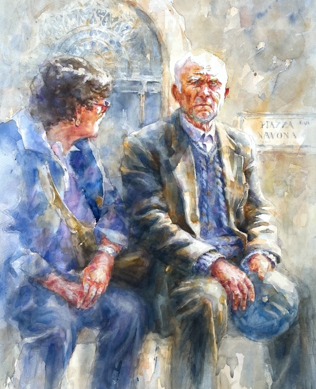
Best of Theme
“Their Golden Years” by Janice Cipriani-Willis
What is extraordinary about this is the gaze on this person. I love the blurring out, the softening of the edge, and the color that brings us to the main character’s face, which we’re seeing straight on. And it hit me from seeing it from a distance, when there was a moment of realization, that the painting is touching our heart. It’s a moment, and that’s what this seems like. That softening helped. I think the letting go of some of the detail on the edges and setting up a sort of a movement with soft and hard edges create that sense of moment. The expression on the face – it’s not taken out of life; it’s not made deliberately to show emotion. It’s like a man feeling something. It is beautifully done.
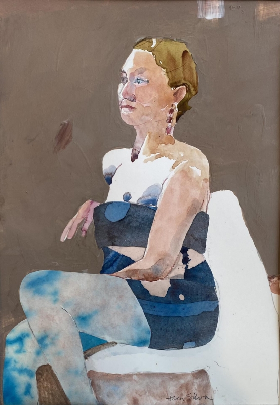
Best Miniature
“My Turn” by Jean Silva
What struck me about this one is that it’s almost cubistic, taking different shapes and composing them like a collage. It has both flat and atmospheric portions. Not only does it have a very nicely depicted figure with its pose and placement on the paper – the format for the composition – but it’s also pieced together in a very interesting way. For example, in the legs, the pattern of the shape is like a sky, a cut out of a sky in the legs. Here the painting is blue and atmospheric, whereas the background is flat. It’s almost a reversal of what you usually see. The artist is very keyed into space, making these little marks at the top of the composition creating just a little break of that edge. It is so important that every little thing that’s left there is meant to count in a graphic way, and the use of color is wonderful.
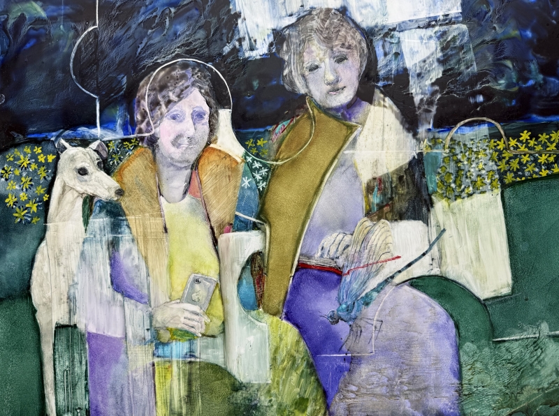
Third Place
“Take the Office to the Park” by Helen Hayes
This a smorgasbord for the senses, especially in terms of all the touching, the rubbing out, and the colors. I love the colors, and I love how that line sort of weaves between people. It mixes a two- dimensional awareness with a rendering of people. One of the figures seems representational, while the other has more of an implied characteristic. I love the dog which contributes to a really warm feeling.
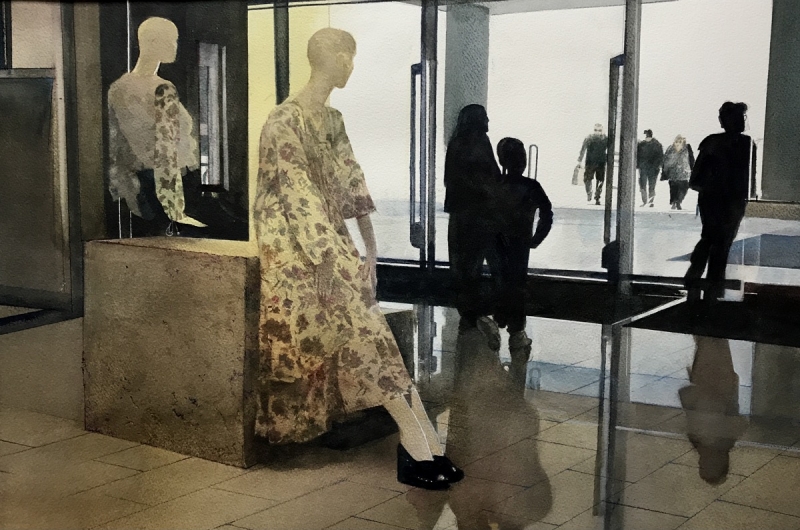
Second Place
“Shapes and Shadows” by Edward Abrams
This painting is striking for its strong quality of light and dark. It has a gentleness, the softness you get from the feeling of light coming through the brightness of outside against the shadow inside of the building. It’s a great inside-outside. piece. It also has a delicateness, which is in the fabric of the mannequin. It’s a warm and cool composition, indoors and outdoors, yin and yang, mannequins and real people. In the composition, there are things close up, yet there’s something in the middle ground that is denied to us because it’s all in black. And then there appears, in the bright light, another set of figures. I like that descending diagonal going to the outside, going towards the light. I think it implies something much deeper than just how nice it is to look at.
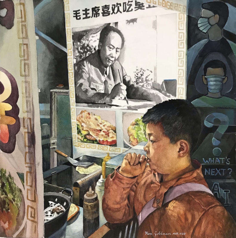
First Place
“May You Live in Interesting Times” by Ken Goldman
This caught my eye very shortly after I came in, and I had two reactions. One was from far away, and I noted the contrast and the composition with strong verticals. I feel like I’m in a spiral, it really takes me in and keeps me there. And as I got close, there’s a real richness of life lived in the city, and care shown between the chef and these different spaces, the graphic spaces. It has a very nice realism, as well as a two-dimensional graphic quality. What really strikes me, however, is the richness of the painting, not only in the formal sense, but in a cultural sense as well. The artist really noticed a lot of things and wove them all together. It is very impressive.