Juror: Barbara Tapp
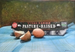
Juror Commendation
“Pasture Raised”
by Hong Beaven
This painting is illustration based the opposite from abstract – and is the work of a highly skilled draftsman. It has an interesting perspective that leads us into the painting. The color choice is excellent. Using different colors of blue introduces contrast and keeps it from being flat. It is a beautifully rendered, excellent watercolor.
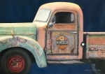
Juror Commendation
“Hancock Motor Tune Up”
by Edward Abrams
The level of this painting is illustration, it is very pleasant and very well designed on the page. The parts do not detract from each other, and the focus is the cab of the vehicle which forms the center of attention. The artist is a very skilled draftsman, with a lovely sense of understanding of how to get textures that are not predictable. You can find lots of things to look at here.
Juror Commendation
“Sandi Shores”
by Chuck McPherson
This is a narrative painting that serves as an illustration. There are good washes at the back. I almost want there to be more in it, but I like the spontaneity in the brush strokes. It is a perspective driven painting, and is beautifully painted.
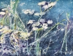
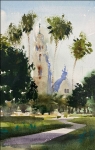
Honorable Mention
“Shallow Pond”
by Rebecca McCullough
This painting has a good color harmony using a limited tonal pallet with a beautiful background color. It is very appealing, and has lots to look at and explore. I like the mix between larger positive shapes against the linear grasses. There is a big dynamic woven into it.
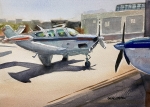
Honorable Mention
“Blue Is Ready To Fly!”
by Gabriel Stockton
In a very unpredictable manner, this painting curves a wing that shouldn’t be curved. It has captured dynamic shadows in the right places. There is a beautiful change and gradation in the washes. The plane is very clearly defined by vague shapes in background. The focal point is sharply drawn with an intense shadow, and a play of light with the hanger and the airplane. It is a narrative painting, with a beautiful color sense, with a dash of red used in just the right place.
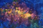
Honorable Mention
“Flower Power III”
by Astrid Edel Walter
I just find this painting exciting, with all the merging shapes. It is a happy painting although somber in coloring, with the main shape surrounded with darker colors. Overall, it is an attractive and interesting painting, one that piques my curiosity.
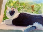
Honorable Mention Miniature
“The Sweet Spot”
by Gloria Henderson
This painting has soft lines and a little bit of contrast in a charming perspective view of a cat lying in a window in warm light. I love the effect of the tail and foot against the darks of the body’s background.
Best of Miniatures
“Cool of the Morning”
by Gabriel Stockton
The strength of the painting and its design is that it leads you in. There is a very good placement of whites, and the eye continues into the blue shadows. It is very fresh.
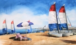
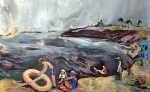
Best of Theme
“Day at the Beach”
by Sarah Sullivan
I love the brushwork. This is an illustrative painting about brushstrokes. There is feeling of a cold “June gloom” in the painting, but you know that temperatures are warm because it is at the beach. The color palette is really unusual. There is a lot to look at, but it is not over-rendered. The sailboat contributes movement, and I like the contrast between the sea and the white of the raft. Although the shapes are abstracted, as you look at it you see the children playing.
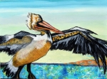
Third Place
“Pelican”
by Nancy-Jo Klaphaak
All the edges are defined by contrast. The background has harmonious color choices, and it has an exciting design. I react to it because it is a nice narrative painting. Complementary opposite colors make for great contrast. The wing plays against the beak, and all the shapes are connected very well. This is a very well composed painting, yet loose in technique. It is aesthetically pleasing, with elements of unpredictability.
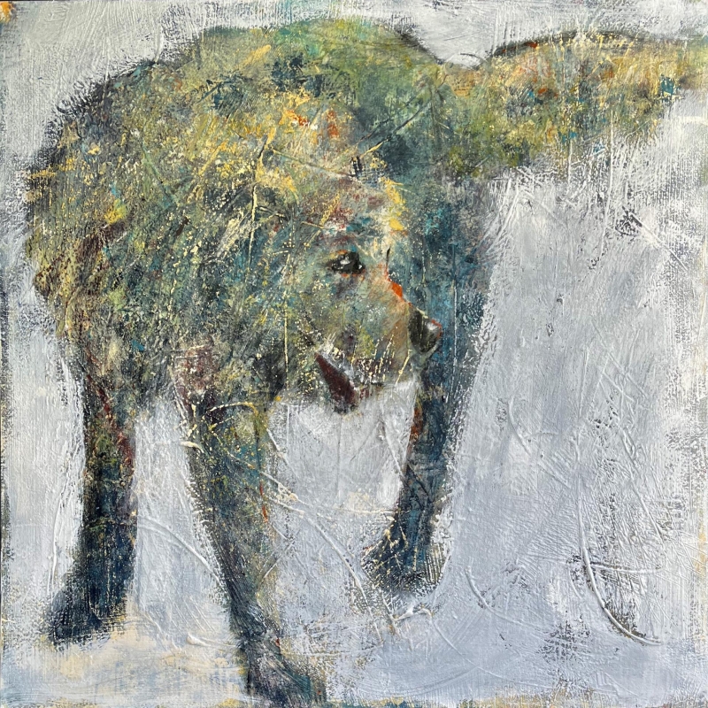
Second Place
“Linus” by Susanne Slater
Although this painting is abstract through its elements, we can see a mouth, nose, eye – and we then see it as a dog. The character of the dog comes out due to the rhythm and directions of textures . It is a very well constructed abstract, with a warm feeling. The artist knew how to direct your eye. It is a very exciting painting, with beautiful, harmonious color. The “lost-and-found” edges are very appealing.
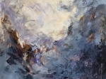
First Place
“Somewhere In Time”
by Betty Hock
I have a love for the chaos and abstractness in this painting. Although that takes a tremendous amount of calculation, the work is so free. The light source comes in from 2 directions, which is very pleasing. There is a motion between colors. This is a true abstract without being obvious that it is so intentionally done, but with unintentional aspects that create a dynamic and exciting painting. The choice of calligraphy is exciting, the artist knows the materials, is very confident and knows where to stop!