Juror: Edward Abrams
Juror Commendations
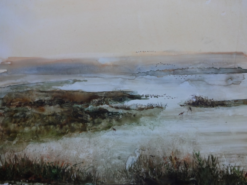
“ Twilight Over the Wetlands” by Susan Weinberg-Harter
I did like the composition, and the way the paint is handled. I like the flocks of birds. It’s comfortable, it’s nice, it’s very pretty.
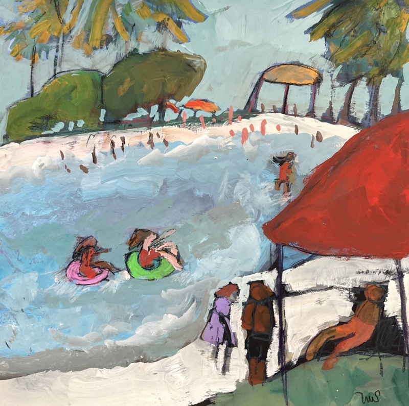
“Bonita Cove Morning” by Sarah Sullivan
There is nothing to do with surf, although it looks like a surf scene. The design got me right off, the colors are strong, there is a lot of fun in it. I like the haziness of it. It’s colorful, it’s pretty.
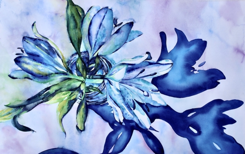
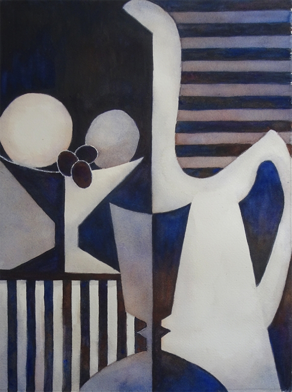
“Moody Blues” by Susan Keith
It’s extraordinary. I do love the way the watercolors are used here, it’s amazing. It’s very pretty. I always like the way shadows are handled. The shadows become magic in this, they are so strong. This kind of feels like that – it’s strong, yet it’s delicate.
Honorable Mentions
“Happy Hour” by Julie Anderson
The design and the black and white, I appreciate it. It has an abstract feel, but it’s not really an abstract, I just like the design of it.
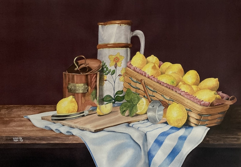
“A Basket Full of Lemons” by Carolina Dealy
I saw this first thing when I walked into the gallery, and I liked it. It’s well painted, it is designed nicely, it’s a comfortable painting. I noted the use of colors; of course, you have lemons so what are you going to do. It is a pretty painting.
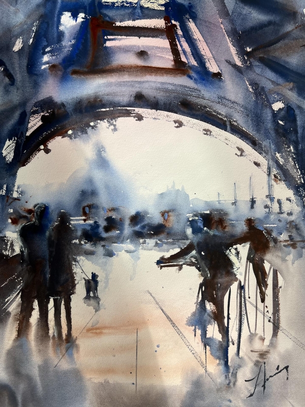
“Paris” by Luis Juarez
It is really fast and fun and to the point, you get the message. You can more or less see and feel the activity in it, which I think is what he is trying to do. It is a strong painting.
Honorable Mention, Miniatures
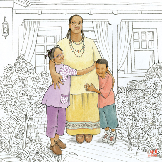
“The Hug” by Laurie Mitchell
The first thing that catches your eye is that it is largely black and white, although it is a watercolor. There is an unusual use of the space. It’s a really happy painting.
Best of Miniatures
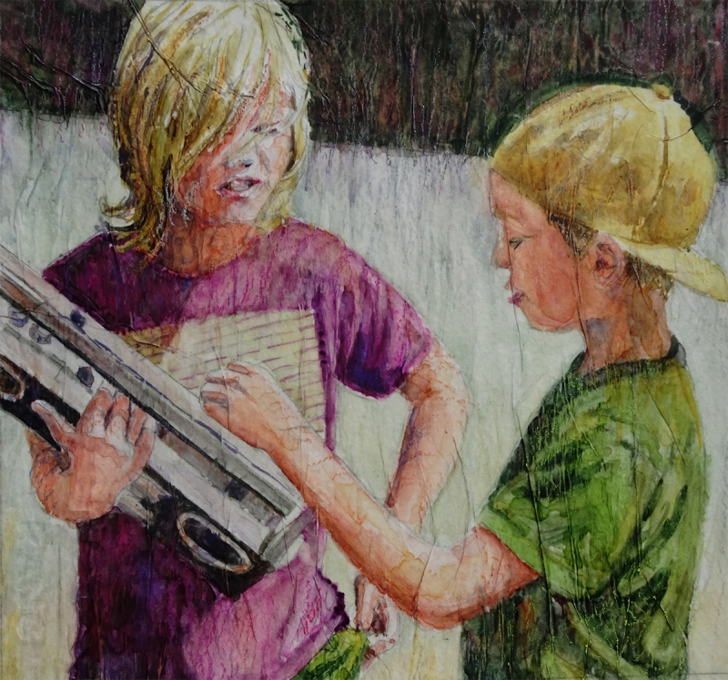
“Check it Out, Study” by Julie Anderson
The relationship between the two figures is striking, and the technique is extraordinary. It’s just beautiful, so well done. The design sense of the picture looks well put together. It’s excellent.
Best of Theme
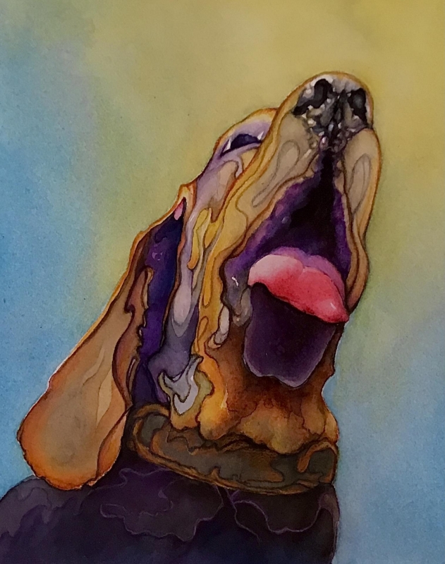
“Happy Days” by Ann Slater
This is a happy dog, he looks like he wants that soup. The colors and the way the artist handled them, the composition and the design, in the way the lines go together, it works really well. You want the dog to talk; the attention off the frame.
Third Place
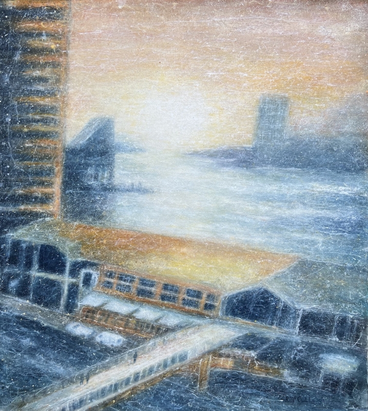
“Harbor Sunrise” by Rebecca McCullough
It has in a way an abstract feel to me, a distinct placement in time and space. You could be somewhere in it. It’s one of those paintings you have to look at for awhile before you can really say what you see. It’s very nice.
Second Place
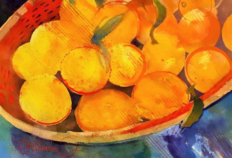
“Lemon Zest” by Chuck McPherson
It’s beautiful, I love the color, the graphic sense is important and nicely handled. And his style of painting shows that he knows what he’s doing, the strength shows through, it comes out strong, it’s like what he intended. Really, it’s just a pretty painting.
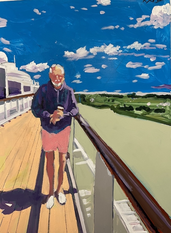
First Place
“On Deck 8” by Richard Glassman
What I liked about it starts with that there is a nice atmosphere, it has the space, somehow the colors add a lot of meaning to it too – I loved the colors. I also connected to the qualities of the person in it.