April 2026 Members Show
“Paradise on Earth”
Juror: Susan Keith
.
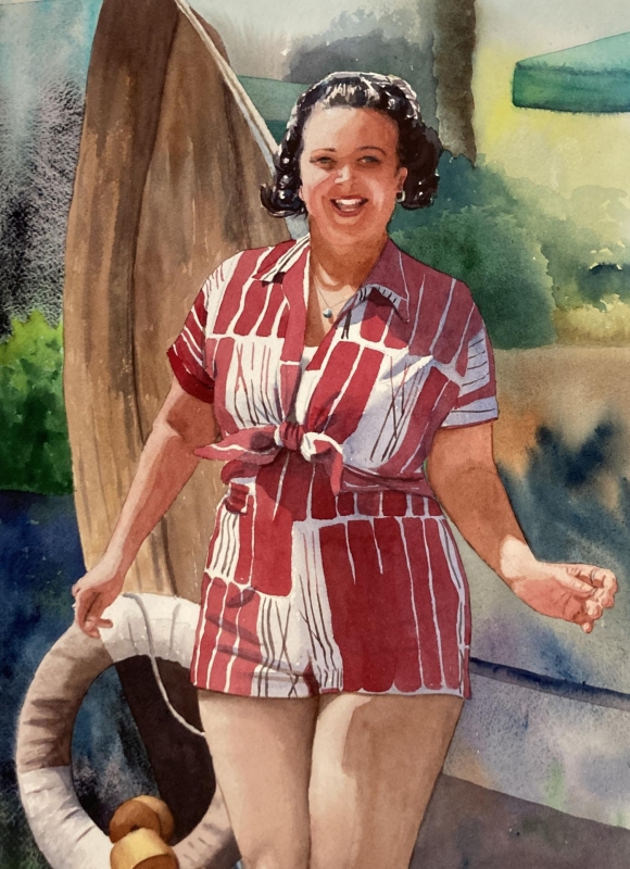
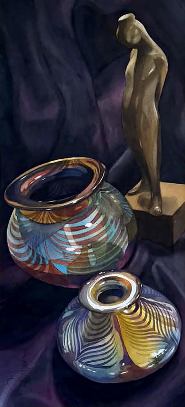
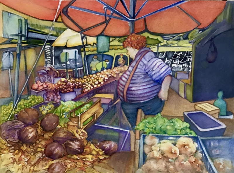
Juror Commendations
“Go, Sally, Go!” by Stephanie Van de Wetering
Well, Sally just looks like she’s having fun, and that she’d be a great friend to spend time with. I love the values in her romper, and the juxtaposition between the complementary colors of that red and the greens in the background. The artist really captured the warmth of the light on the figure. Wonderful!
“Manuelita Meet the Abelman’s” by Chuck McPherson
The colors in the pottery are beautiful with the reflections of light hitting the swirling shapes throughout. The use of the values of the purple shown in the draped fabric in the background draw your eye vertically into the composition.
“The Marketplace” by Ann Slater
This painting is just fun. The diagonals draw you into the figure, who looks like they are contemplating every single vegetable in front of them. That orange umbrella overhead unifies the whole composition. I just enjoy it, and it makes me smile.
Honorable Mentions
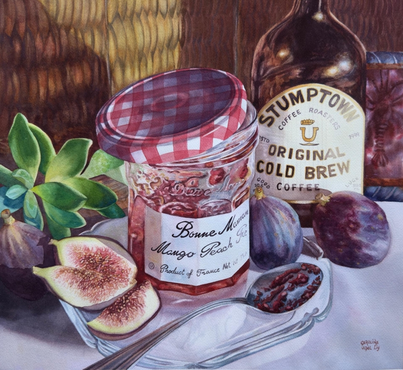
“Not My Jam” by Carolina Dealy
I appreciate the details in this painting, and the technical ability that the artist has with the watercolor. I admire all the reflections and the texture, and the details of the lettering. All these are beautifully done. I also appreciate the unity of color – the purples and the red violets. I think the diagonals draw your eye into this skillful composition.
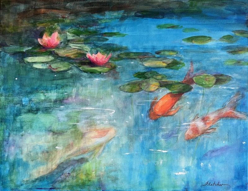
“Undercurrents” by Jane Fletcher
The cool colors of the water are in great contrast with the warm colors of the koi and the flowers. The composition, with the movement of the lily pads and koi draw your eye into the painting.
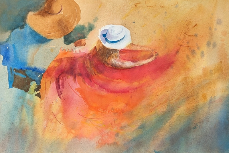
“Beach Pirouette” by Mirjam Schippers
I love the center of this painting where the figure is created in the swirling movement of the paint. There is just a little bit of detail to indicate the figures. The colors are vibrant, and the warm colors surrounded by the cool colors are very effective.
Honorable Mention, Miniatures
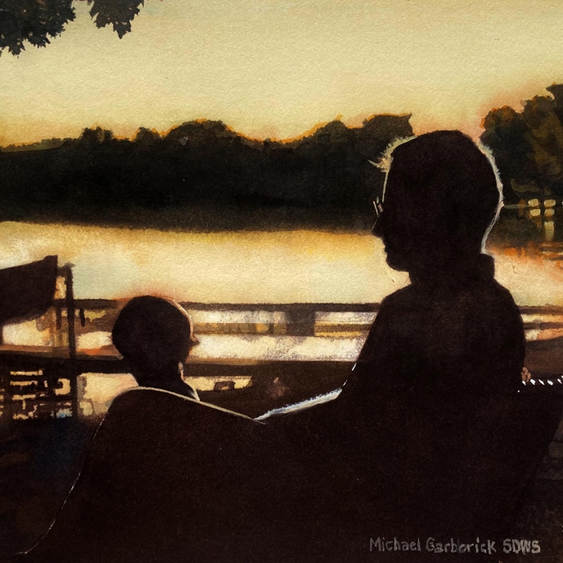
“An Enjoyable Day” by Michael Garberick
The color is monotone and monochromatic. The high contrast is softened by the blended edges along the shapes and figures in the composition. You can imagine a quiet moment between possibly a father and his child. I like how the horizontals break up the space and the color.
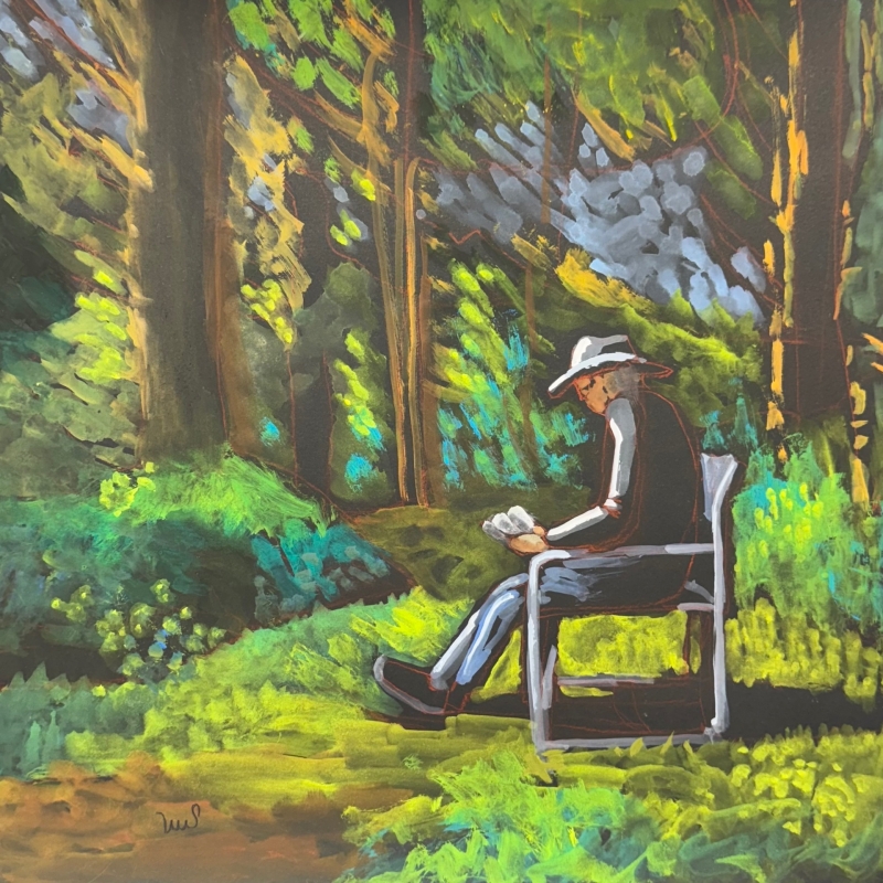
Best of Theme
“Reading the Afternoon Away” by Sarah Sullivan
I’m drawn into the painting by the cool values of green, and the dabs of colors created with the paint strokes. The diagonals of these strokes moves the viewer’s eye into the light which is cast on the figure. You can feel yourself sitting in the warmth of the sun with him as he’s reading.
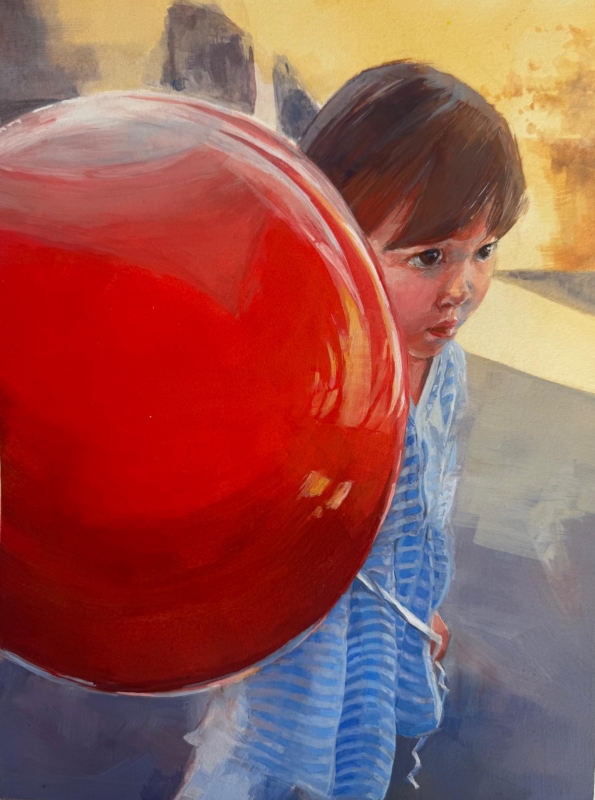
Best of Miniatures
“My Balloon” by Hiroko Fisher
The composition in this is very striking with the focal point being the red balloon and the child’s face. Features that caught my eye include the reflections in the balloon, and on the child’s face and hair. The soft neutral- colored diagonal shapes in the background draw your eye in and complete a good composition.
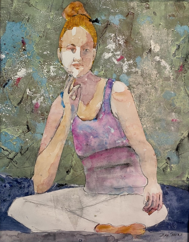
Third Place
“One Fine Day” by Jean Silva
The effect of light on this figure is stunning. The textured color created with the layering of the paint in the background draws the attention to the figure’s simplicity. Very good!
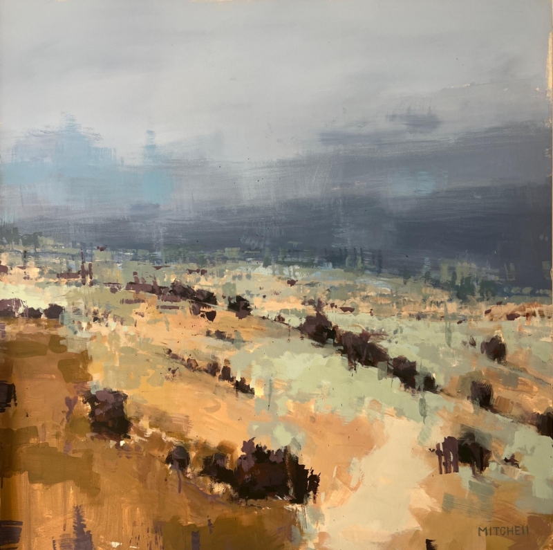
Second Place
“Storm Horizon” by Jane Mitchell
This painting has such a big sky effect that you’re swallowed up into the landscape, with its soft colors. The cool colors are in contrast against the warm colors and work together so well. I love the abstract effect that the artist has achieved with the brush strokes, and the layering of color.
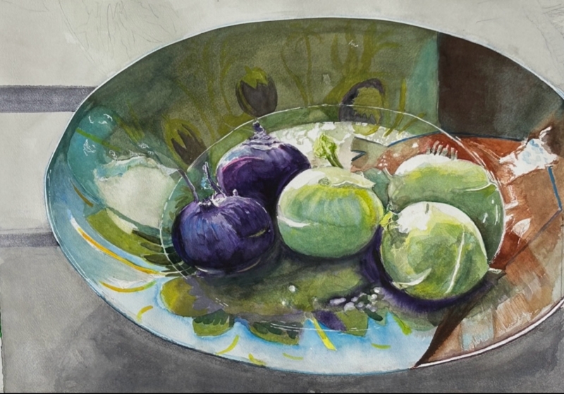
First Place
“Kohlrabi For Sale” by Susan Hewitt
This painting is stunning. The colors all work together harmoniously, The composition is wonderful, with the bowl cut off on the edge and the patterns and shapes inside are circling the kohlrabi. It’s woven together beautifully, with the soft, transparent watercolor.