Roberta Dyer, Juror
Juror Commendations
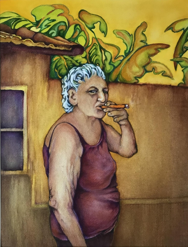
“Cuban Traditions” by Ann Slater
The shapes and the forms in this painting are well thought out – just extraordinary. The rendering is tight but in an organic way, so that it feels like a loose painting. The colors are warm, and that goes with the theme of the painting. The bright yellow at the top really sets off the foreground. The surface of the building behind the figure is really nicely rendered. The figure’s hair has colors that are not found anywhere else in the painting, and that focuses the eye on the figure, which is where it belongs.
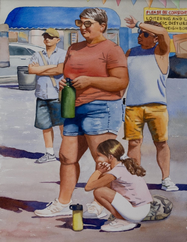
“Street Fair” by Stephanie Van Der Wetering
This one is the essence of summer! You can feel the heat in it, with the positions and postures of the figures. The values are soft, but the darks keep it from being a pale painting. It uses a limited palette and has a wonderful composition. The darks really hold the composition together, with the horizontal lines and shapes. It is beautifully painted and is an excellent piece.
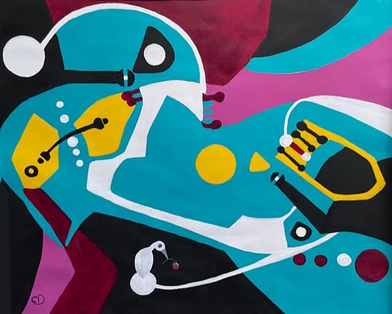
“My Playground” by Carolyn Dubuque
I love the way the artist used flat shapes to create her painting. The lights and the darks are masterful here, the darks frame the bright patterns inside. The whites dance across the surface and draw your eye into the painting. The palette choices are just so fun – magenta, yellow, turquoise. The design is excellent, and it is fun to look at.
Honorable Mentions
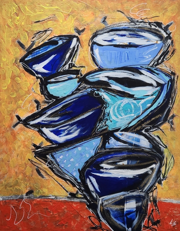
“Vibrant Cups” by Lucas Smith
I love the playfulness in this. The way the cups are stacked is impossible, and that makes the design engaging. The colors are bold. It is held together by the blues and the cuneiform pattern and by surrounding it with brightness and happiness. I could look at it for a good long time and not get tired of it. The background jumps right out at you, but it works. The composition is good. The shapes are flattened, yet the texture in it admits to a lot of give and take. It is a great piece!
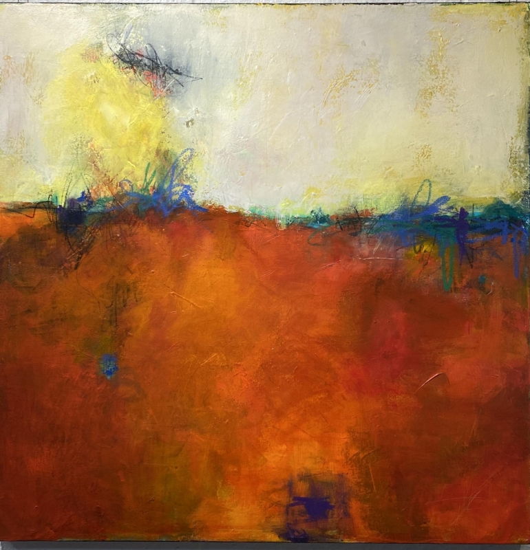
“Chasing the Sunset” by Michele Joyce
This one is hot, hot, hot! The design is excellent. There is a mastery of the surfaces. You feel a lot of history in the textures, of the working of the paint. It draws you in, with the uniqueness of the techniques. You feel the heat, you feel the summertime. The scribbled marks are fun and playful, and they bring the whole painting together.
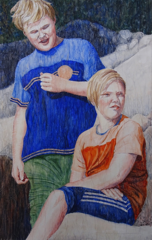
“Brothers Being Brothers” by Julie Anderson
This painting shows a mastery of design and of the use of a muted palette. There are all these wonderful colors going on! The composition is extraordinary, and the use of the horizontal stripes is perfect. You can just imagine what the brothers are up to, and you wonder what is being said between them. The darks and the lights in the painting are really well thought out, and the entire painting is extraordinary.
Honorable Mention, Miniatures
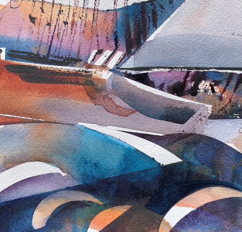
“Sailing Away” by Lorrie Lynch
This uses traditional watercolor in a beautiful abstract composition. The whites are saved by planning ahead, yet there is a freedom of design and movement throughout the piece. I am always drawn to a square format. I love the color choices, and the way she keeps control in some areas and lets the paint just flow in others. The darks and the lights are beautifully placed, and the shapes of the forms keep your eye moving. It is a beautiful piece.
Best Of Miniatures
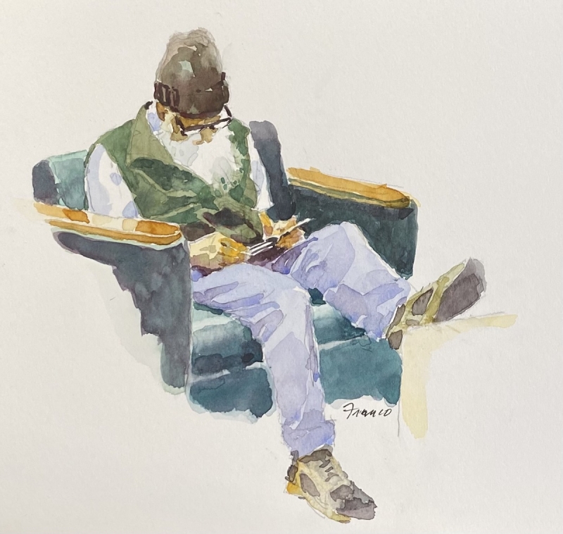
“Library Man” by Thomas Franco
It is very simplified. It is a terrific composition, almost a cruciform. The way he laid down the watercolor is very decisive, and he lets the watercolor do what it does best. He is not overly concerned about detail. I love the vignette format here, where the suggestion of a footrest in the middle is just enough to make the feet make sense. The value shift is excellent, and I like the color palette.
Best of Theme
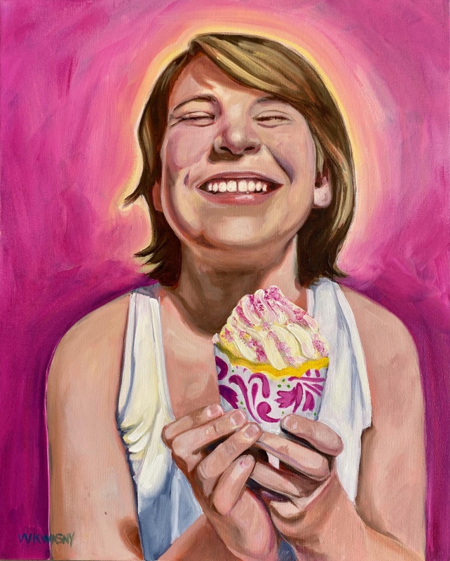
“Joy in a Cupcake” by Wendy Kwasny
For this little girl, the fun is right there in her hands. It is beautifully painted, with the figure unapologetically right there in the center, and she makes that composition work. I love the bright fun colors. Her smile is extraordinary. She is just… happy. This speaks to the theme of the painting so well.
Third Place
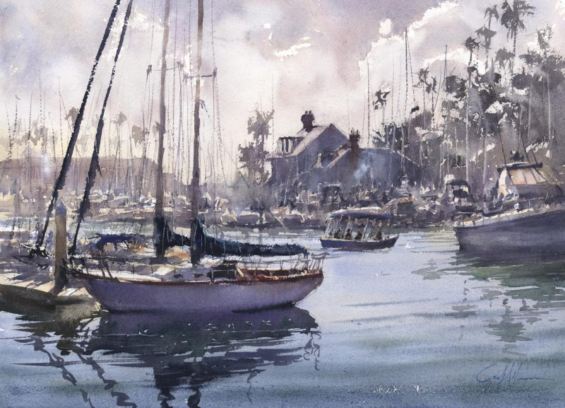
“Far and Away” by Geoffrey Allen
This artist is a master of plein air painting. His work gets at the essence of being outdoors. There is spontaneity yet it is well planned. He gets aerial perspective down perfectly as the objects in the background tend to fade away in the atmosphere. His shapes are beautiful, with the warmer colors in the front, and the water looks like you could jump right in. The sky is just wonderful, and the calligraphy is excellent. The piece has beautiful composition.
Second Place
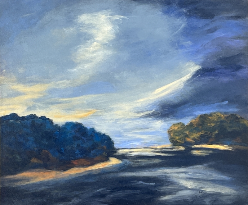
“Beyond the Shallows” by Betty Hock
This is a beautiful use of a limited palette. The darks and lights are strong and are in the right places for the composition. The dark shapes work to lift you up into the sky. There is a lot of mystery and feeling in it. This artist makes darkness work really well. The lights of the colors around the middle third of the painting are broken but there is still a line that they define. There is good separation of foreground, middle ground, and background. A gorgeous abstracted landscape.
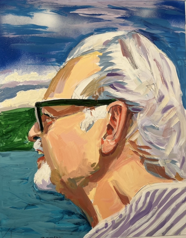
First Place
“Whale Watching” by Richard Glassman
This artist is unapologetic about what he does. He doesn’t follow the rules, but he has an ability to make a painting work, using bold strokes and vibrant color. His people are interesting. I love the stripes of the shirt that move up into the hair with the lavender brushstrokes, and then on up into the sky. His bold colors don’t necessarily harmonize but they work in a strong and compelling composition. He has mastered the medium and makes it enhance his message.