Juror Rise Parberry
.
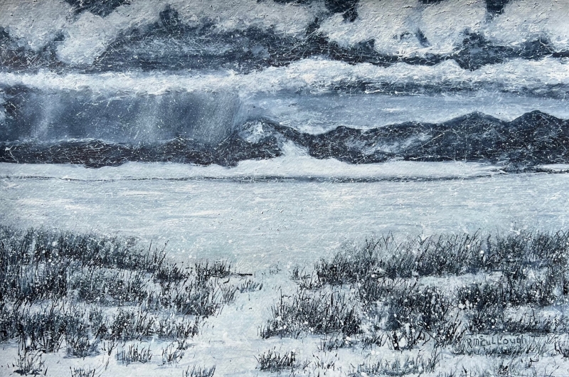
Juror Commendations
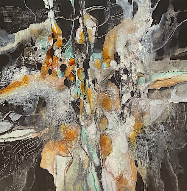
“Trio Tangled Together” by Donna Arnaudoff
This is a very abstract painting with a limited color harmony but with a warm dominance, and the design radiates into the center instead of out from the center. I love all the line work. It’s not just gratuitous swishing. Rather, it all contributes to the rhythm of the painting, and it’s very delicate and lovely.
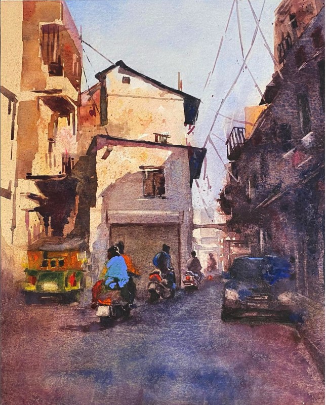
“Let’s Ride” by Mohamed Ibrahim
This is a really nice example of plein air painting with a lot of structure, a lot of light and dark. There is color contrast with the warms of the buildings against the cool blue of the sky echoed in the one rider’s blue shirt. It draws you right into the painting. It’s not real, but it makes it feel real.
“And the Rain Came” by Rebecca McCullough
This is a monochromatic painting, but it is so organized, emphasizing the horizontal bands except for the one white path leading in. The values are so strong, which is something that we often forget about in watercolor. But here it is the first thing that the viewer sees. It is very nicely textured, and I like that. But it still remains a watercolor painting.
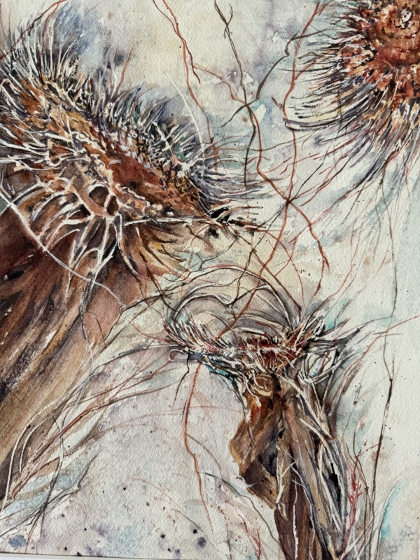
Honorable Mentions
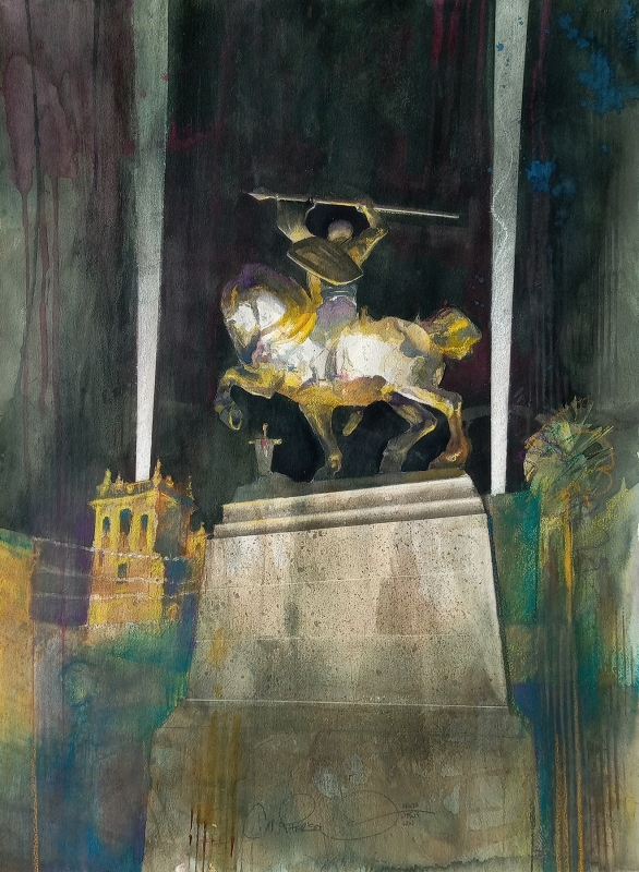
“Dark Knight of Plaza de Panama” by Chuck McPherson
This is an unusual painting, and I enjoy the watercolor technique which uses planes and facets of value and color. Nighttime paintings are extremely hard, especially for watercolorists, because we all rely on the white of the paper in the design. Yet this has the whites on the horse on the statute that just drives the viewer right in. I like the arbitrary white searchlight panels in it too. It is a really fine painting.
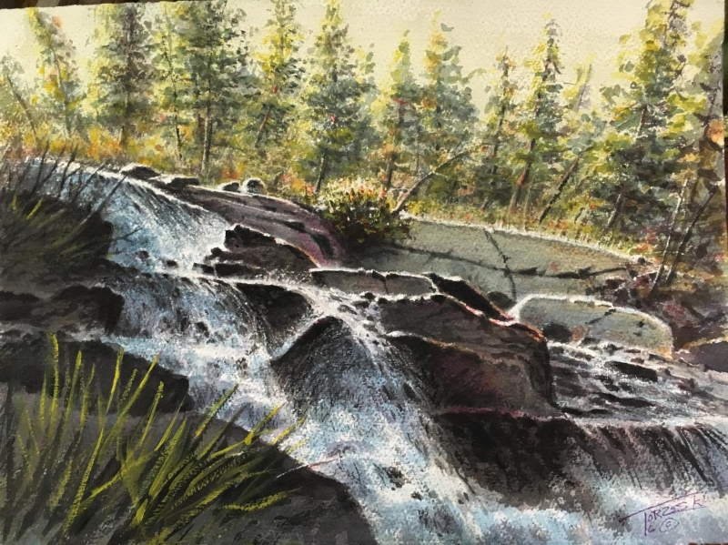
“Waterfall” by Ski Torzeski
The transparent watercolor works so well here. The light flickering through the droplets and the facets in the waterfall make this piece so appealing. It is a small painting, but people will come across the room to see it. It has a muted color harmony and is delicious.
“Rumors” by Kathleen Scoggin
This is a strongly organized piece with a great deal of detail. There are many different ways in which the paint has been applied to the canvas. It has a lot of rhythm. You feel like you’re looking at something organic like trees or cliffs or landscape, but it doesn’t say it in a blatant way. It is very entertaining and will look great on the wall.
Best of Miniatures
“Oh No!” by Julie Anderson
This is a very intentional painting, with an intentional color harmony, and beautiful composition. It is a big painting in a little frame.
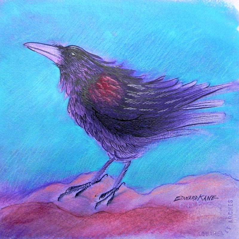
Honorable Mention, Miniatures
“Rainy Day Raven” by Edward Kane
I really love this raven with its wonderful color harmony. I love the way the beak and the tail feathers touch the edges of the frame and carry the raven form across the painting. I love all the little brush strokes too.
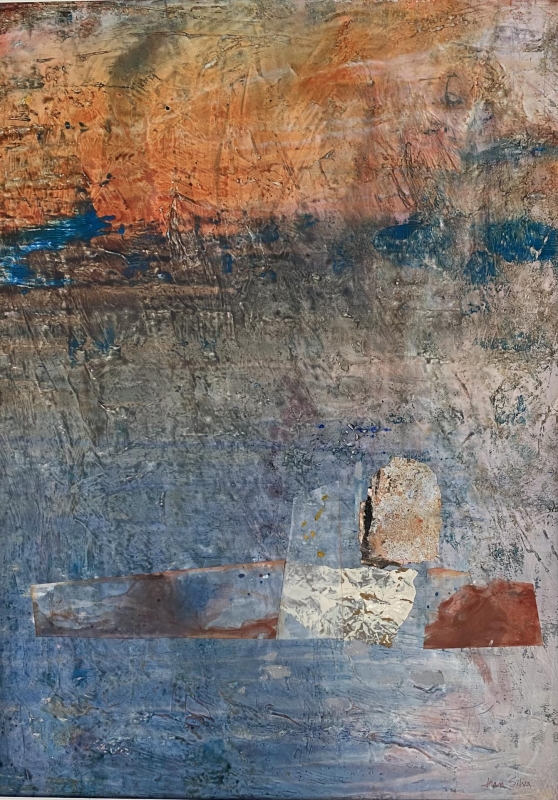
Best of Theme
“In All Simplicity” by Jean Silva
This is reality imagined, and it really suits the theme of the show. It is both vibrant and translucent and still organized without being gratuitous in line or shape. It is gorgeously restrained but vital.
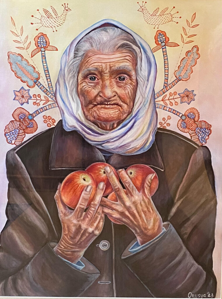
Third Place
“Forbidden Fruit” by Orysya Barua
This is an allegorical painting. It is about culture, and folk stories, and it is beautifully rendered. The technique is really nice. It is a traditional pyramid composition, then embellished with all the beautiful folk art, and a limited color range. It’s a lovely story!
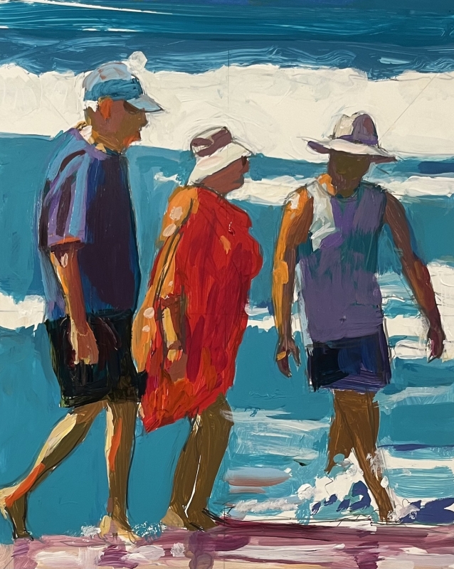
Second Place
“In the Surf” by Richard Glassman
This is such a primary painting as regards colors, and I love its directness. It has so much strength and yet the figures are touchable, warm, you can tell that they are living, and they are having a great time on the beach. It is a great composition, and it works so well.
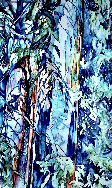
First Place
“Shape Shifting Shadows” by Susan Keith
This is such a beautiful painting, a real painting. You forget that the structure of it is quite academic. It has vertical bands in a tall vertical format with analogous cool color with a warm accent. You don’t even really see that consciously, but it is what gets you across the room to this painting. It is so beautifully organized even though it is complex.