Juror Ken Goldman
Juror Commendations
“ Morning Light”
by Edward Abrams
A beautiful treatment of cast shadows coming from the trees. I like the limited palette used. The rosy sky is duplicated in the shadow colors with the neutrals with a little bit of the rosy quality, and the shadows stand out against the greens. The painting is technically excellent with a complex and difficult visual situation portrayed.
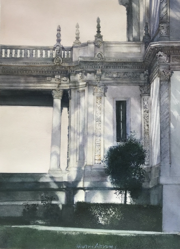
by Edward Abrams
“Montana Thunderhead” by James Hoffman
There is an immediate feeling of Maynard Dixon, with the southwest quality. I love the crepuscular rays coming down, and the angular cloud shapes. There is a lovely sense of atmosphere, with the zenith being thinner and warmer at the greatest height and thicker as it goes down in the air where there is the most moisture. This really deserves a commendation. The middle ground of the landscape is wonderfully done.
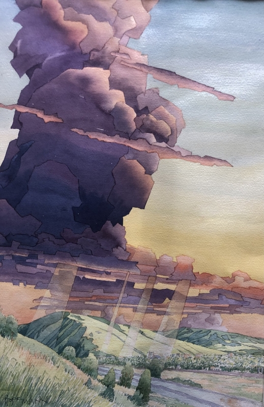
by James Hoffman
Honorable Mentions
“Main Street Fantasy”
by Lori Mitchell
Beautiful painting! The great calligraphy is whimsical, and beautiful. I love the girl sniffing over the bakery. It is so different from all the other paintings in the show; so unique to what the artist does. It has lovely colors, and everything about it is worthy of the award.
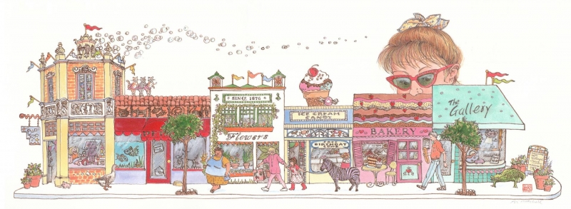
by Lori Mitchell
“The Gathering Place”
by Cynthia Roach
Beautiful design, I love the colors, the neutrals, also the vibrant blues and purples popping up against the yellow background. Design-wise, it is a double golden mean, the right side with dark heads against the light background, the left side with lighter heads against a dark background. This makes for an intriguing design. The stylized figures have a gestural quality to them.
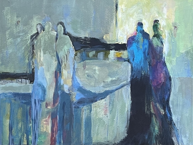
by Cynthia Roach
“Not Sorry”
by Marty Atwell
Beautiful! I thought it was a Japanese woodblock at first, with the somber colors, and symbols that are just wonderful. The triangles have accents as do the circles. The representational but not highly defined flower contrasts with highly defined shapes behind it. Calligraphy is echoed throughout and gives a good sense of depth and lyrical quality. The brush strokes are varied yet they have a continuity.
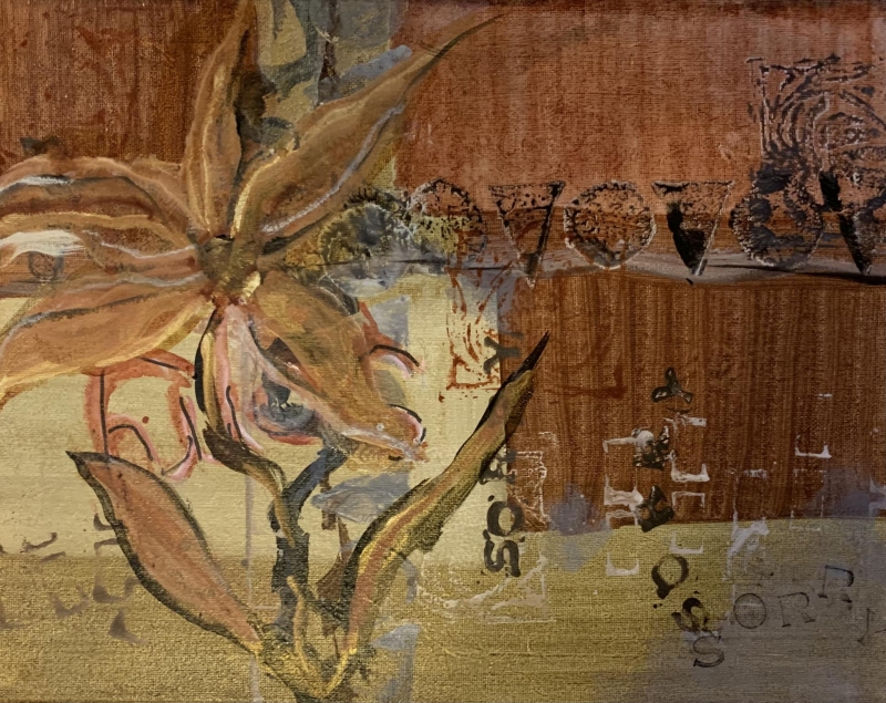
by Marty Atwell
“Cherry Blossoms”
by Susan Arab
It has a wonderful texture! It is a really beautiful painting, and reminds me of Jackson Pollack in a less drugged-out state. The dark accents really come forward against the light background. The artist really controlled the warm and cool colors nicely.
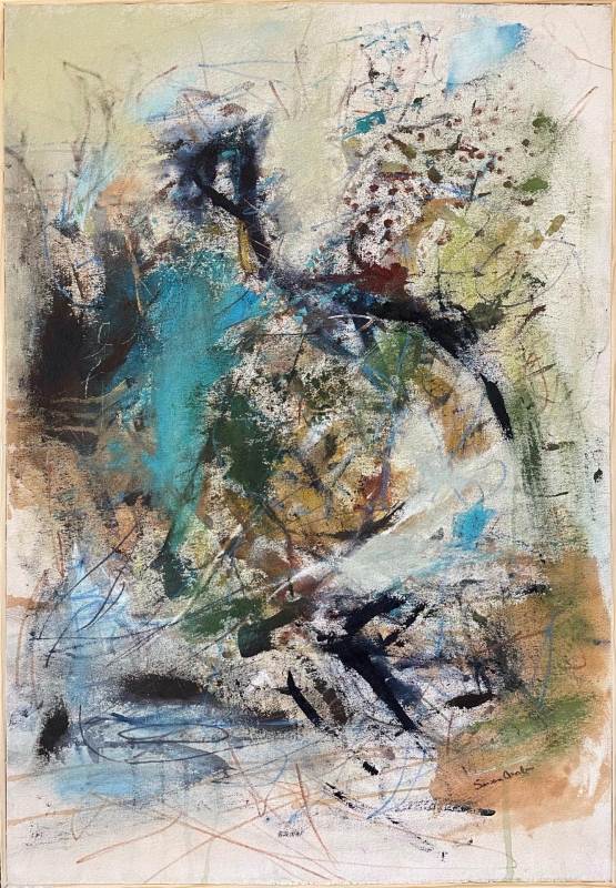
by Susan Arab
“Hoping for Clear Skies”
by Rebecca McCullough
It is just beautiful, very atmospheric. There is great restraint, using the great dominant of horizontals, and the few vertical elements provide contrast. Mission accomplished.
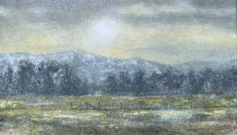
by Rebecca McCollough
Best of Miniatures
“Techy Tuna”
by Wanda Honeycutt
This has about everything working in it, a nice distribution of color and texture, size variation, repetition, contrast, all the principles of design are there. Simple areas and complex areas, variations in texture. semi abstract but recognizable. Abstract enough as to show the abstraction as a goal. It all holds together, which can be difficult to do. This painting is easy to appreciate.
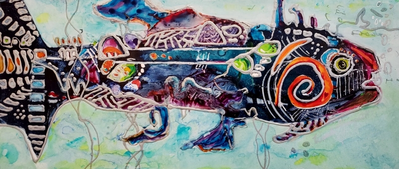
by Wanda Honeycutt
Best of Theme
“Medallion 2#”
by Roz Oserin
The theme is “visual dialogues”, and I see here that the artist is having a dialog with the viewer. I almost had a sense of Aztec calendar, then I noticed the beautiful repetitions of the circle throughout, and the repetitions of the horizontal lines at the top and the vertical ones at the bottom. It has a harmonious composition, and it speaks to me. The foreground and background have depth without being representational like a landscape. The larger vertical paper allows the verticality to express itself.
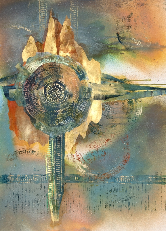
by Roz Oserin
Third Place
“Windswept 3”
by Vita Sorrentino
It appears that the artist has a great sense of the seasons. We see the sunflower, with gravity pulling back the biggest bud, and the open flower moving into winter. The background textures are gorgeous, with a somber quality and a dominance of low-key colors, with occasional accent of a warm coming out. It is not overdone; it is just right.
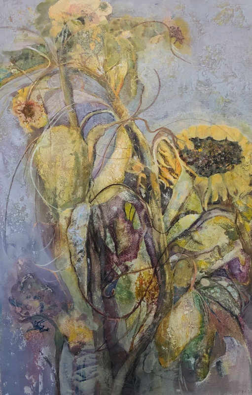
by Vita Sorrentino
Second Place
“Liberty Station Tower”
by Luis Juarez
This is a beautiful and very fresh watercolor. It has a lot of expressiveness, with the calligraphy in the foreground palm tree. The focal point of figures against lightest area brings them into a position of most importance. I like the lost edges and subtle atmospheric perspective of the trees. A limited palette of 3-4 colors at most was used. It is a great impression of a scene, and a gorgeous painting.
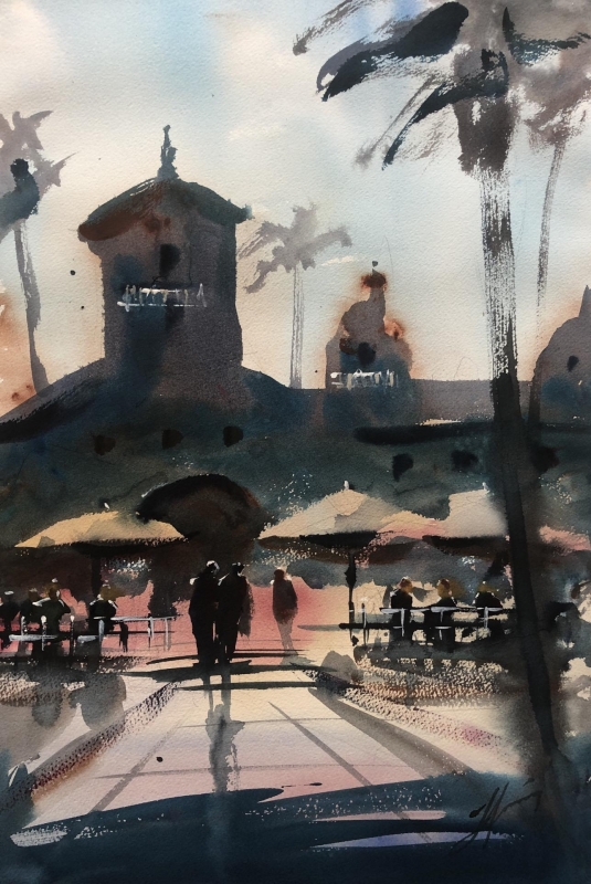
by Luis Juarez
First Place
“Sand Stone”
by Kathleen Scoggin
I love the composition! Also, I like the sense of working from low contrast areas to a focal point so skillfully, from accents of cools to a dominance of warms. Warms dominate just because warms are stronger. The neutrals are just gorgeous. There is great texture, variation between the sizes and textures of lines, and repetition of oval and round shapes. The unfinished areas of the lower left are very effective.
by Kathleen Scoggin